
Updating A Ranch! Home flip #2 2020
- Heidi Lakes

- Jun 7, 2020
- 4 min read
Updated: Nov 24, 2020


This ranch style home was built in 1983. Its a 3 bedroom, 2 bath home with a total of 1971 sf. Its located on Palace Place in the Regency Park neighborhood on the northside of Murfreesboro.
The home is a typical ranch from the 1980's with separate dining and living room and kitchen. Not very open concept! #openconcept #ranch
In the search for our next flip, I was determined to find a Ranch, as they become really nice when you open them up a bit and because I really like breaking down walls! #flip #renovation
Lets take a look at the before pictures first.....
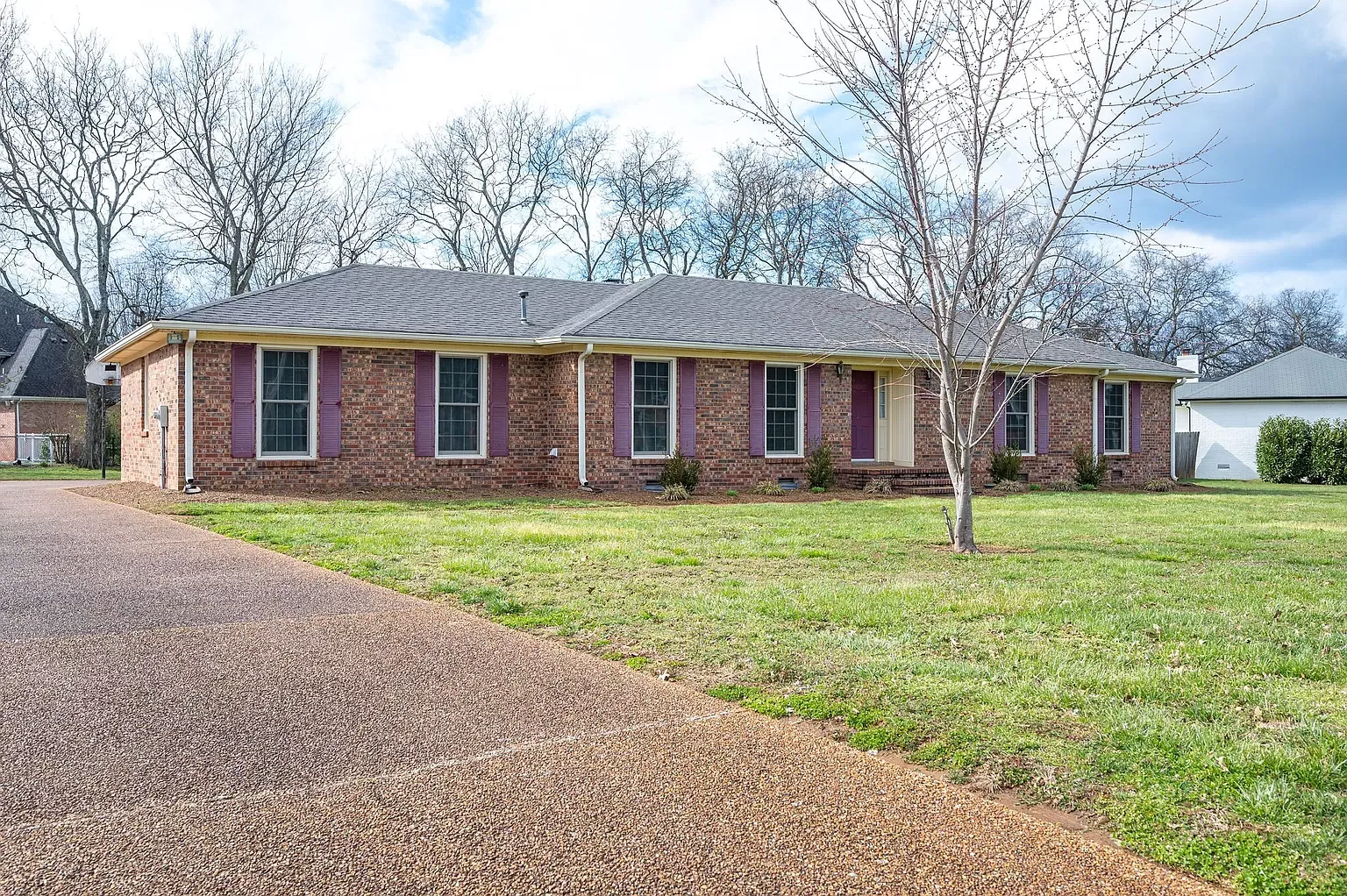

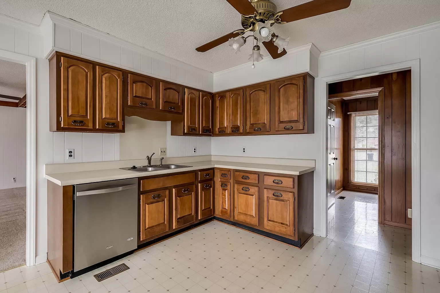
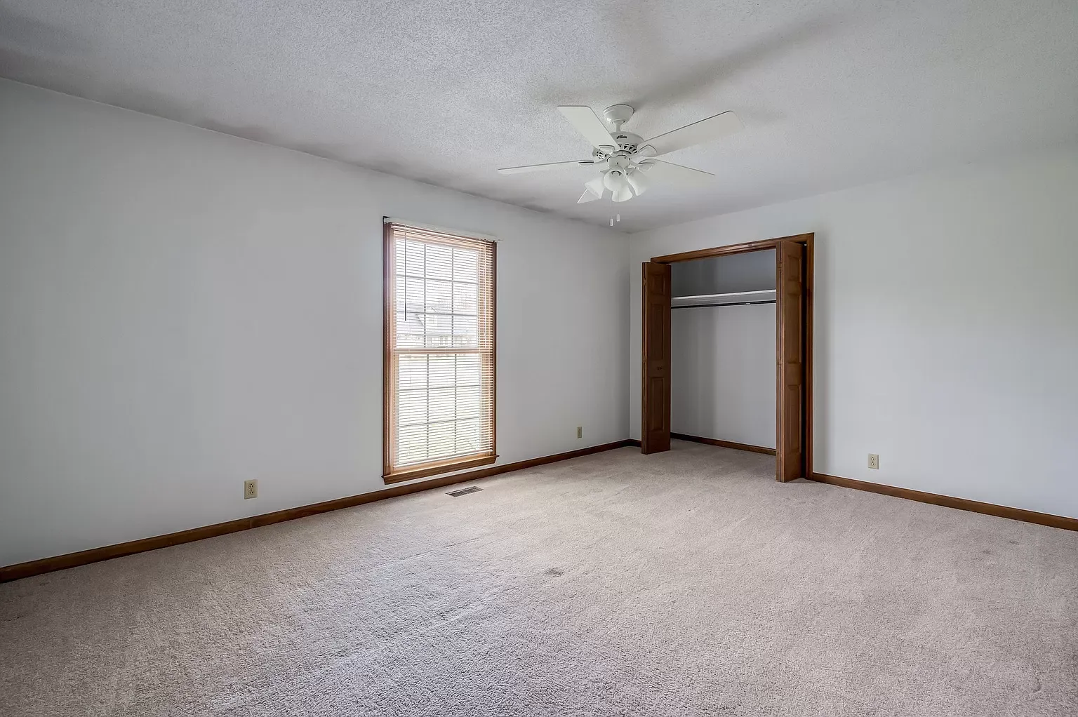
A good house, but a bit outdated. So let's get started with the flipping! #flip #renovation
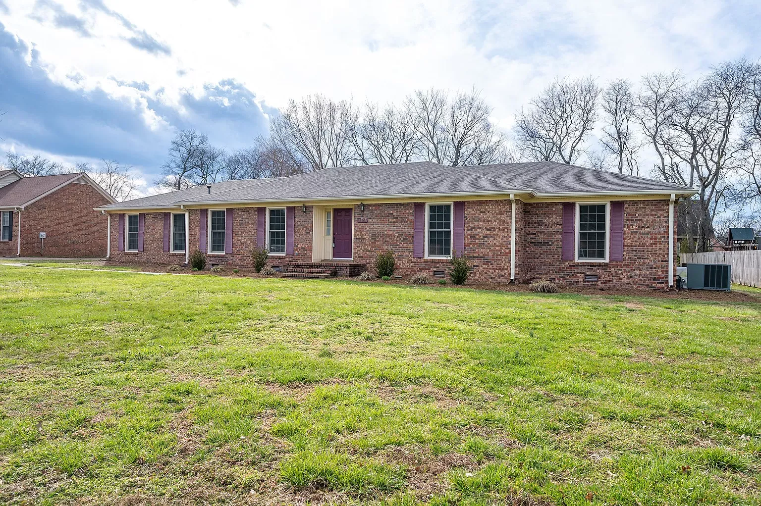
Let start with the outside! My first thought was to paint the brick. So many brick homes are getting painted these days. Its a matter of taste, if you like it or not! I decided to keep the brick at its natural state, as this is something a new owner always can do if desired. Once you paint, you can't go back! Instead We decided to focus on the trim under the roof, around windows and doors, the shutters and landscaping.
All the trim was cream colored and the shutters burgundy - none of which makes the brick look good.

We painted all the trim white and added new shutters in a royal blue color. The front door was in bad shape and didn't help curb appeal, so we replaced it with a new one. We chose one with window panels to bring more light inside and painted it same blue (Naval SW6244). 2 new outdoor lamps were added to the entrance. #Sherwinwilliams #curbappeal


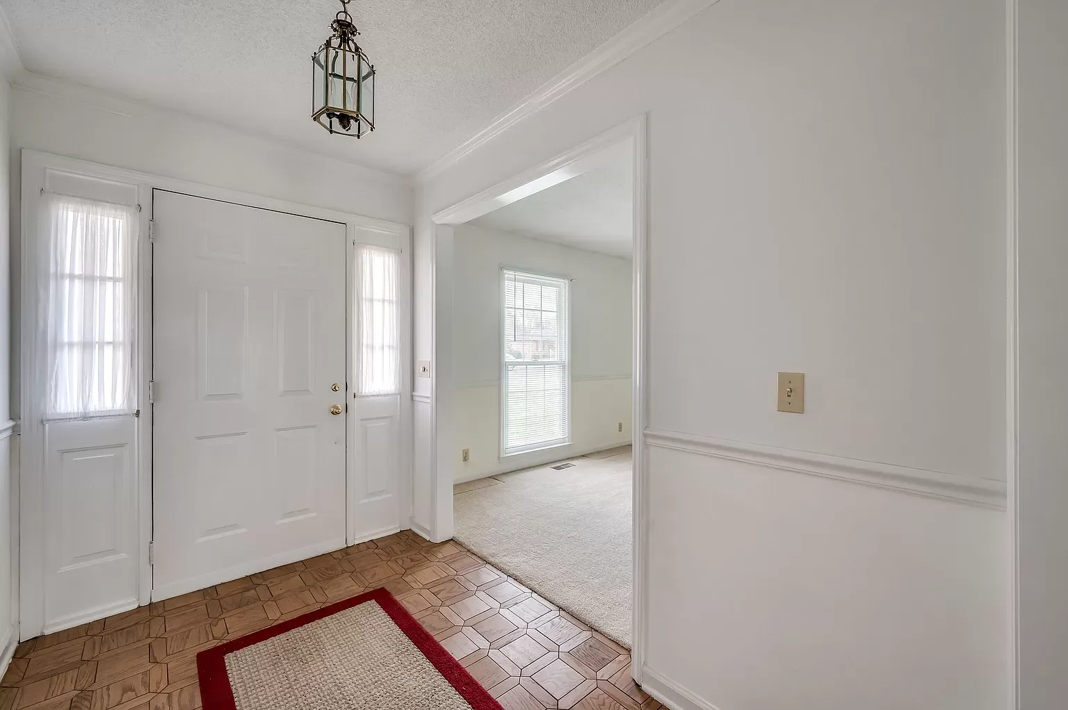
Now let move inside.....
First step was to remove all the carpet from entire house, linoleum from kitchen and bathrooms and hardwood tiles in the hallway. Even though the carpet was completely new, we decided to remove for a more clean and sophisticated look. We sold the carpet on Facebook Market Place as one mans trash is another mans treasure! #Facebookmarketplace


After this our crew attacked the popcorn ceilings. Not a fun job! #popcornceiling


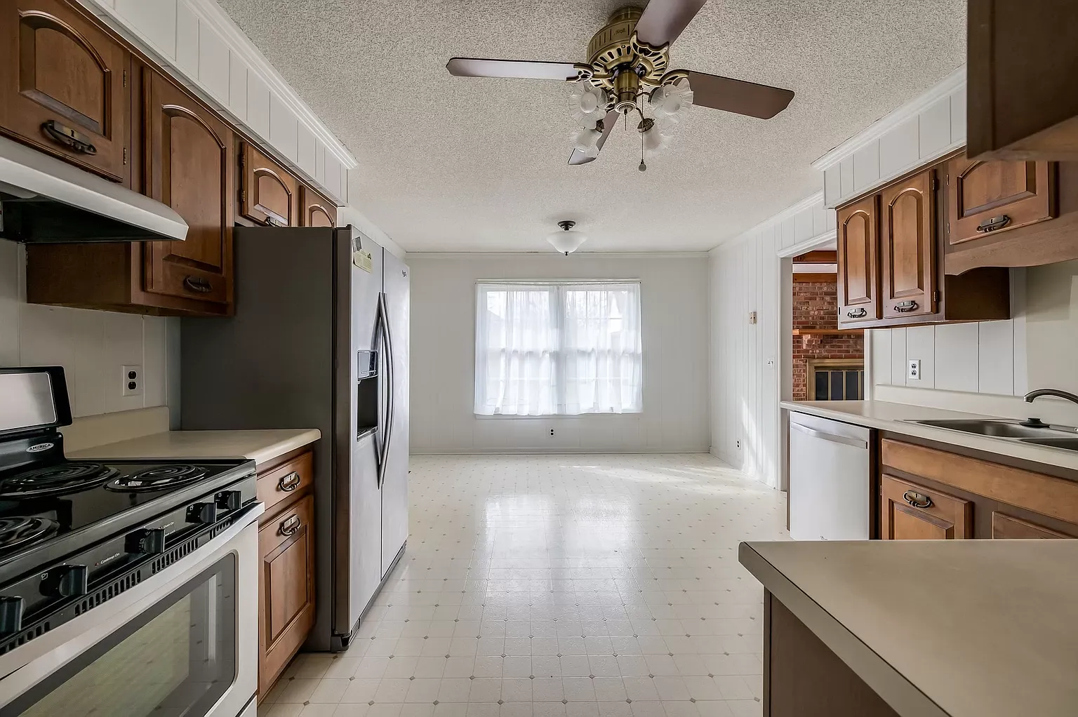
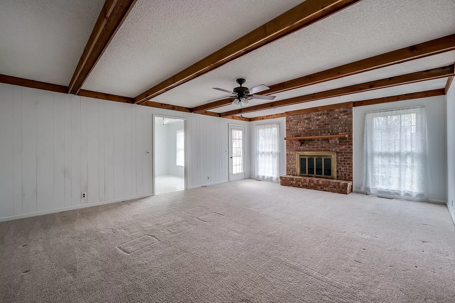
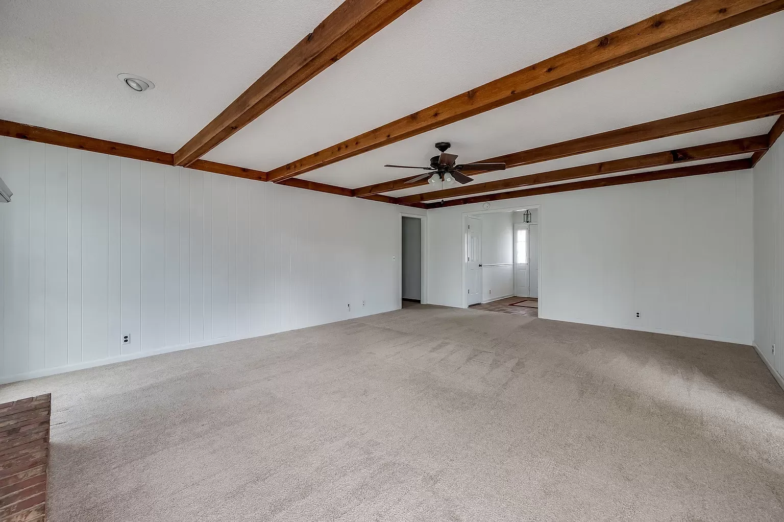
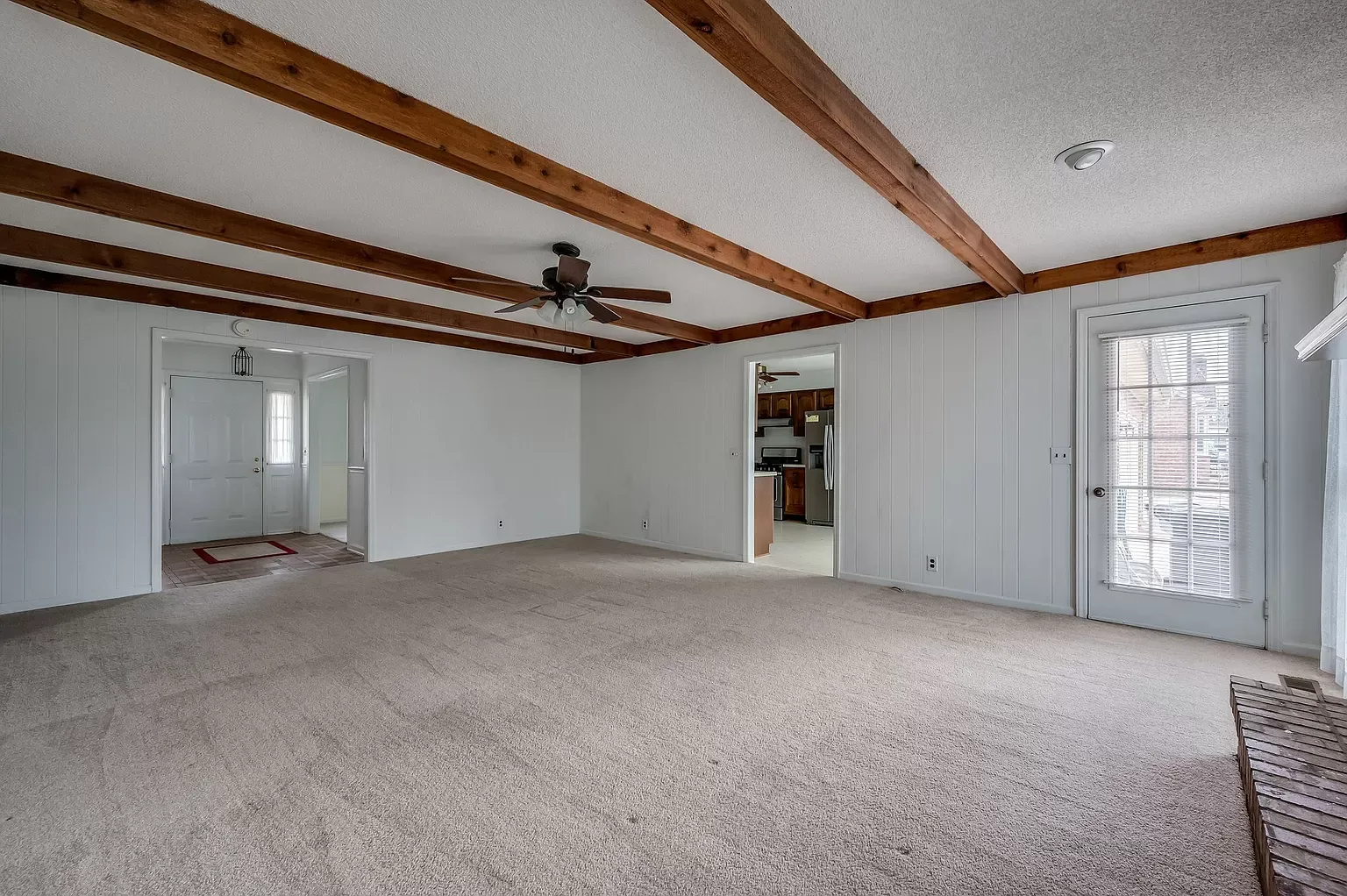
Then we moved on to creating an open concept, so down came the walls between kitchen, Livingroom and dining room. #openconceptfloorplan #demolition


Beams were added so we could remove the low bearing walls. We also removed the faux ceiling beams in the living room since they didn't really fit the more contemporary design we were going for.
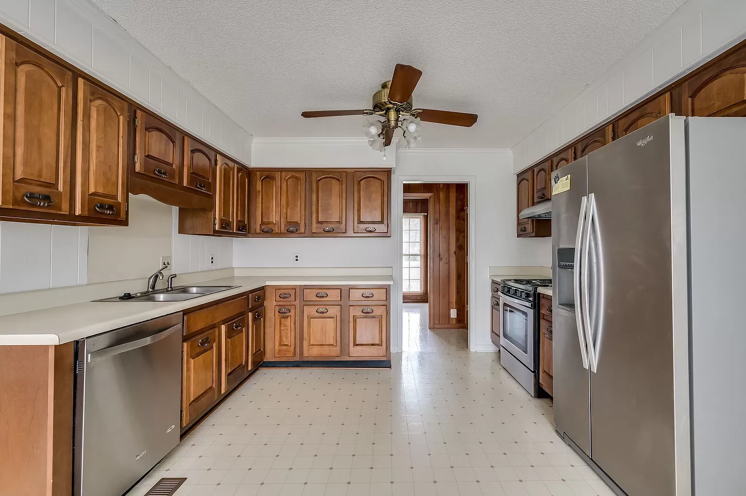
After removing the wall between living room and kitchen, we ended up with some extra cabinets. We used these to create the coffee bar in the kitchen. As a coffee lover, I believe all kitchens MUST have a designated area for coffee making! This could certainly also be a wine/cocktail station! #coffeestation


We added the casing on the top of the cabinets to match the rest of the kitchen. We created a floating counter instead of under cabinets to avoid taking up too much space in the breakfast nook area.
Then all cabinets got painted white!


Wow, already so much brighter.
For counter tops we choose a beautiful white quartz from Mile Stone Surfaces and for backsplash we added a little "bling" by using a stainless steel Metallic brick Mosaic tile. #quartz #Lowes #milestonesurfaces


New brushed Nickle hinges and knobs to finish it off. All appliances were as new when we bought the home, so we decided to keep and only added a new microwave/vent for over the stove #whirlpoolmicrowave #homedepot
Here is pictures of the kitchen at completion. #beforeandafters #transformation


And here is how the living room and dining room turned out!


Now it it for sure an open concept home! I just love the way it turned out.
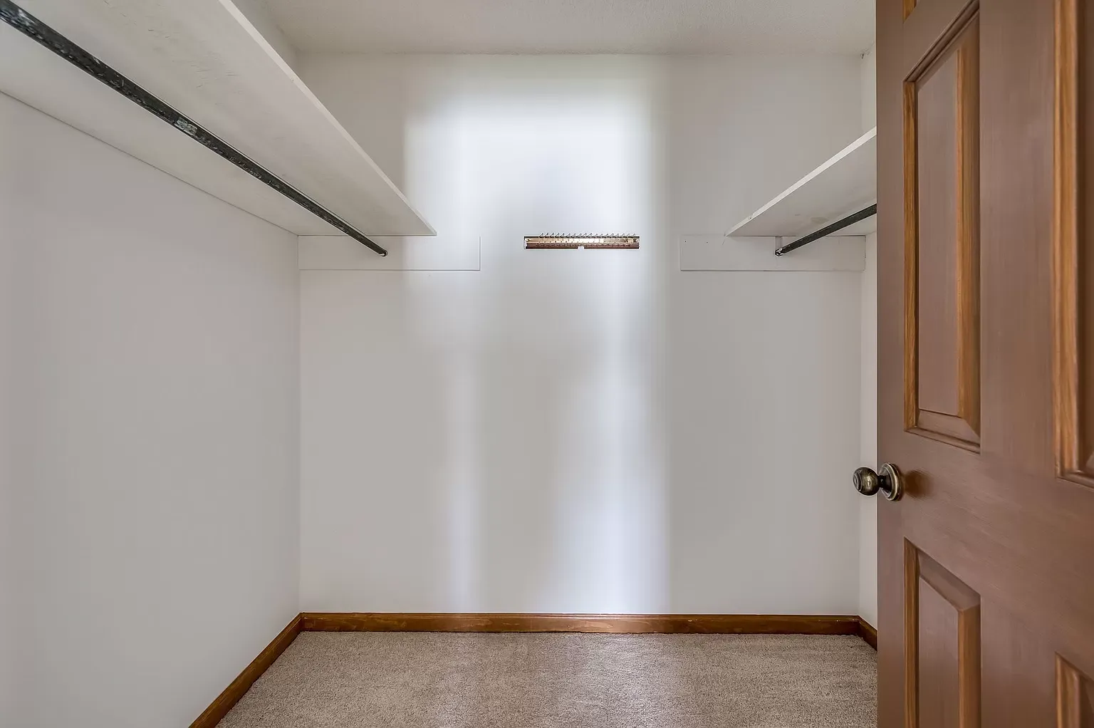
Next we tackled the Butler's Pantry and Laundry room!


This was a problem area for me. Just not a good design! As you can see, the pantry only had one door, but the shelves stretched all the way into to the laundry room making it difficult to see what you have on the shelves in the pantry. To fix this we decided to move the laundry wall with the entrance back about 2 feet, making room for a double door for the pantry.


The transformation is truly amazing. Not only lighter, but certainly much more practical. Now you can call it a Butler's Pantry!
The master bathroom definitely needed some work. The space is long and narrow and divided into two separate spaces with lined closet and vanity in one part and then the toilet and bathtub in the other.
I decided to create one space to make it appear more spacious, so down came the wall making the separation.


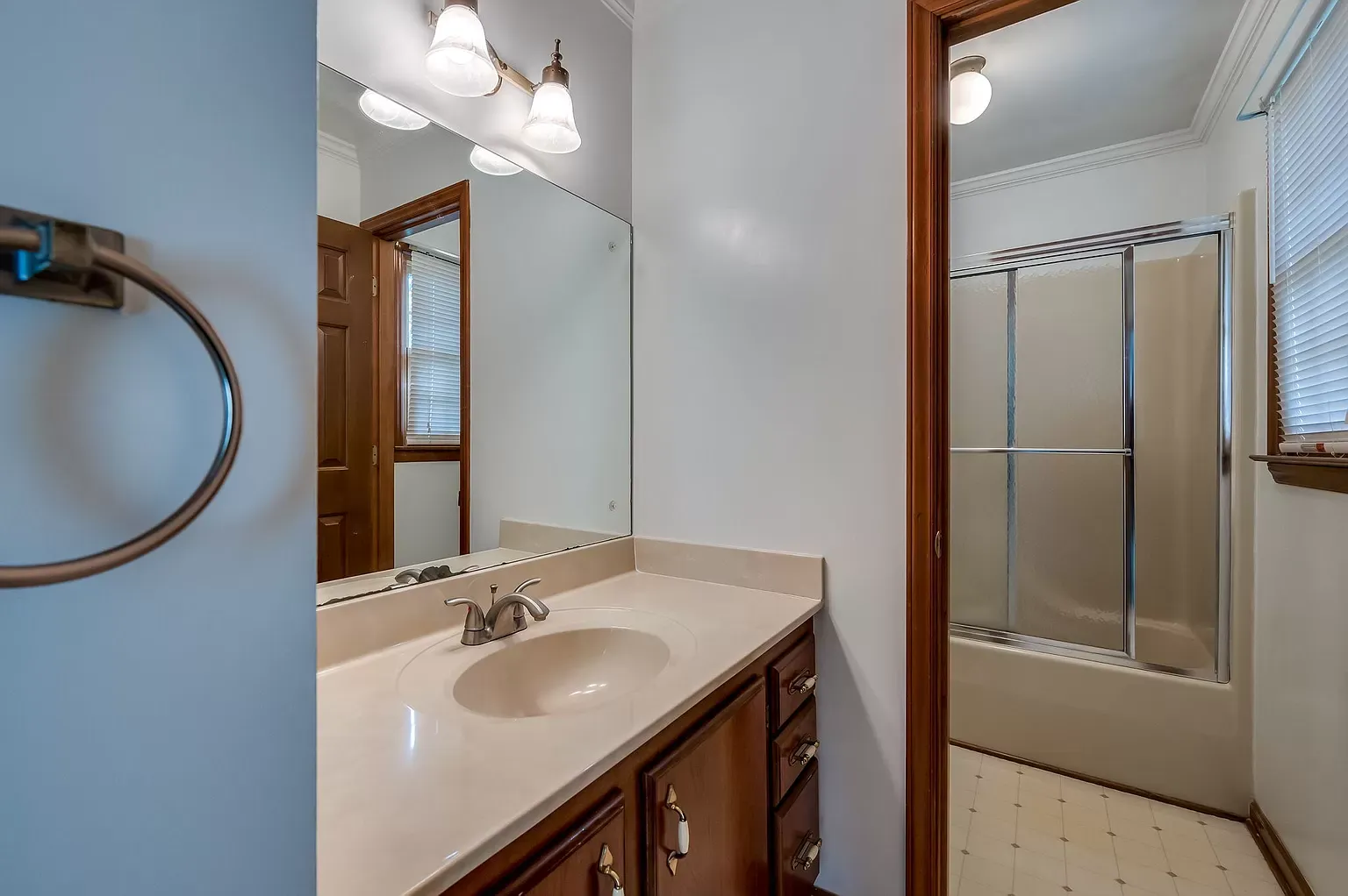
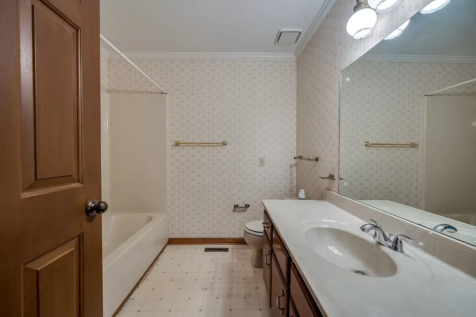
The second bathroom certainly also needed some work....Fortunately, this was the only room with wallpaper in contrast to our previous flip. Wall paper was removed, old bathtub removed and replaced with a new one. The linoleum on the floors was replaced with beautiful dark grey slate tiles and on the wall we put a contrasting tile all the way to the ceiling. We created a large box for shampoo etc. over the bathtub. The old toilet was replaced with a new one and we decided to keep the vanity, but added height and double sinks. New large mirror and fixtures were added. Look very nice, I think!


Another great transformation. Hope you enjoyed the Before & After's!
On to the next project....


Ücretsiz rastgele yetişkin sohbet ve yetişkin chat kesintisiz yeni kişilerle tanışma imkanı sağlar.
Ücretsiz rastgele gabile sohbet ve gabile chat sorunsuz yeni kişilerle tanışma imkanı sağlar.